Drumski Sokolovi
Motorcycle Club Logo
A Complex Badge for the Open Road
Drumski Sokolovi is a small motorcycle club whose identity needed to bring together a falcon, a specific Suzuki Intruder C1800R, the open road, mountains and the Serbian flag – all within a circular Cyrillic badge aimed at riders over thirty. Fitting so many elements and a long name into one clear, balanced mark made this a far more demanding assignment than the initial brief suggested.
Solving the Composition
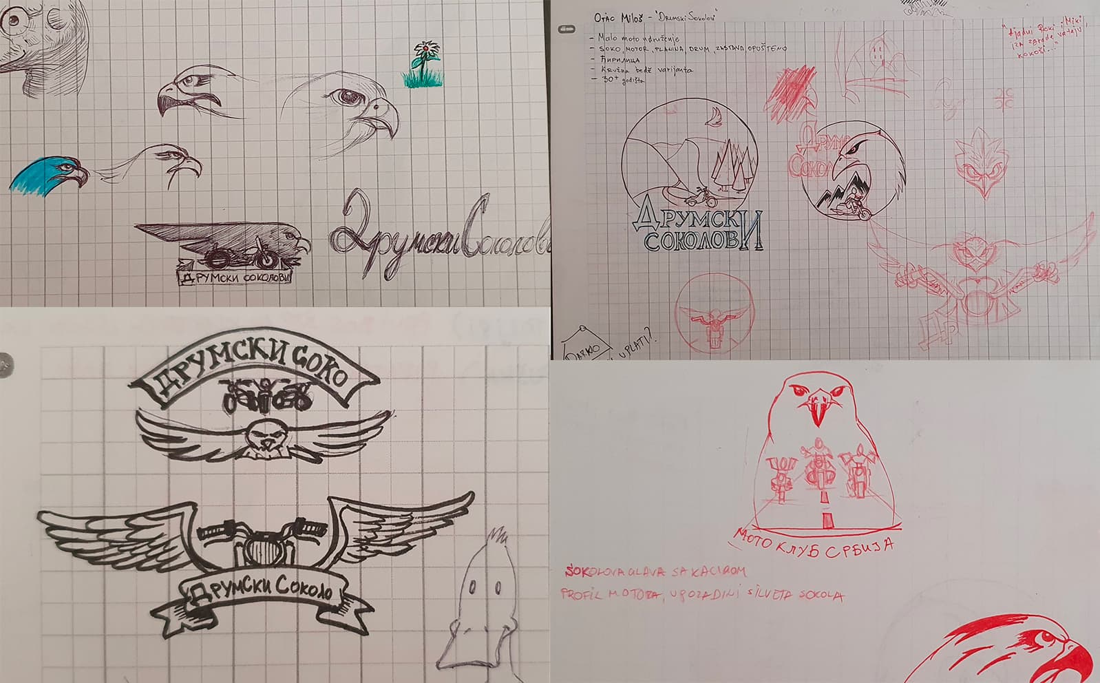
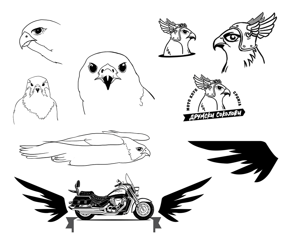
The first sketches focused on finding a composition capable of carrying the entire brief without becoming chaotic. I explored ways to merge the falcon with the motorcycle and the sense of speed and freedom, while leaving enough room for the long Cyrillic name inside a compact circular badge.
Drawing the Right Motorcycle
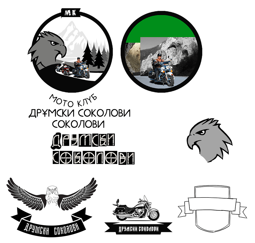
The motorcycle could not be reduced to a generic silhouette – the brief specifically called for a Suzuki Intruder C1800R. Finding a suitable reference of the exact model in motion and carefully redrawing its distinctive shape became one of the most time-consuming parts of the process.
Fitting the Name
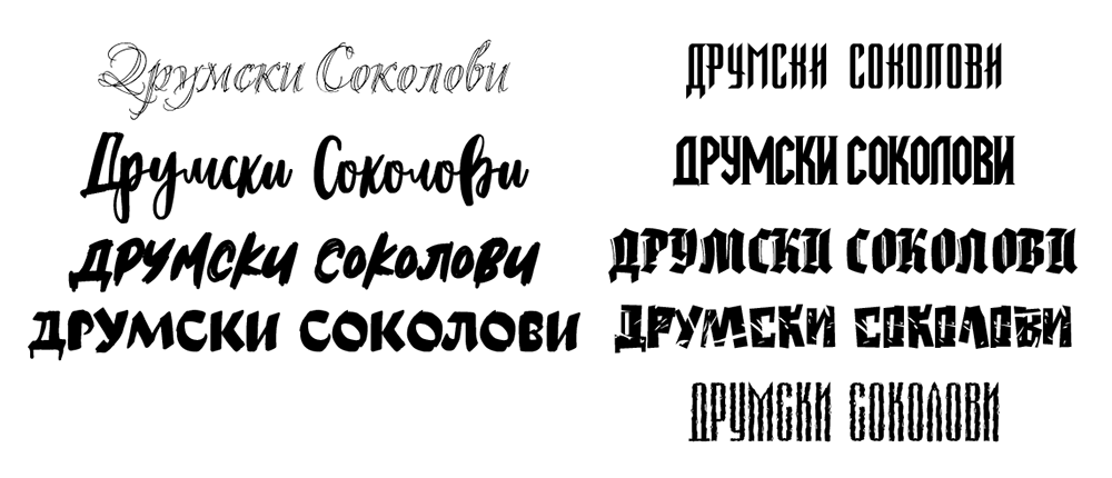
Finding the right typeface was a challenge of its own. The full 15-letter Cyrillic name had to fit inside a compact circular badge without competing with the illustration, while remaining clear and readable even at smaller sizes.
The Final Identity
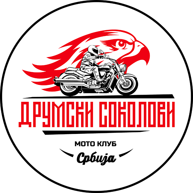
The final badge combines the detailed Suzuki Intruder and its rider with a bold falcon profile, whose sweeping feathers reinforce the sense of speed and movement. The long Cyrillic name anchors the composition, while the restrained red, black and white palette keeps the complex mark clear and recognizable.
When the Project Went Wrong
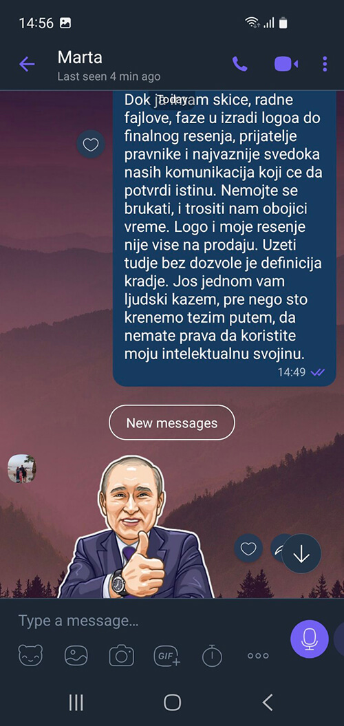
The project was arranged through a friend, and I made the mistake of treating that personal connection as a substitute for a contract and an advance payment.
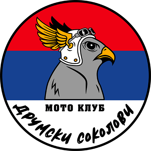
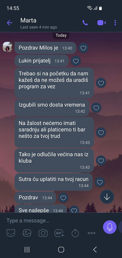
What began as a single logo gradually expanded into light and dark versions, an additional mascot design carrying the Serbian flag, and several rounds of revisions. On February 3, I delivered a 1500 × 1500 px version together with the original Adobe Illustrator file – before receiving any payment.
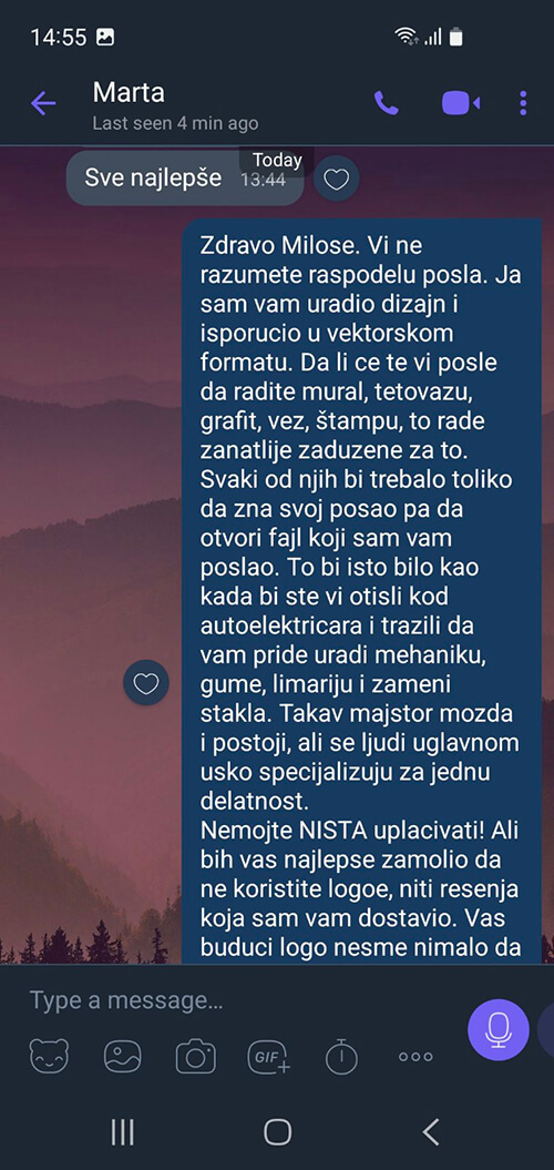
After the files had been delivered, the client, who introduced himself as Father Miloš, a Serbian Orthodox priest, took over the communication and introduced another demand: production-ready embroidery files. Preparing artwork for a specific embroidery machine had never been discussed or included in the assignment, yet I was told that providing it was somehow my responsibility.
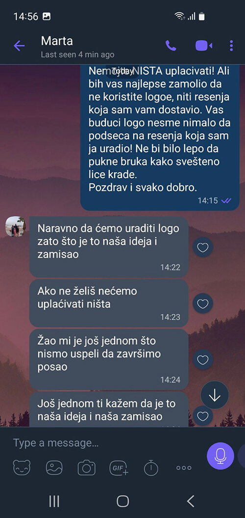
The completed artwork and editable source file had already been handed over. Despite repeated promises, no payment ever followed.
What This Project Taught Me
- Always use a contract. Define exactly what is included, what is not, the stages of the process, the number of revisions, delivery formats, deadlines and payment terms.
- Take a 30–50% advance payment. Work does not begin until the advance has been received.
- During the review process, send only small, watermarked preview images – not production-ready artwork.
- Full-resolution raster files, vector source files and other agreed deliverables are released only after the final payment.
- Never confuse titles with integrity.
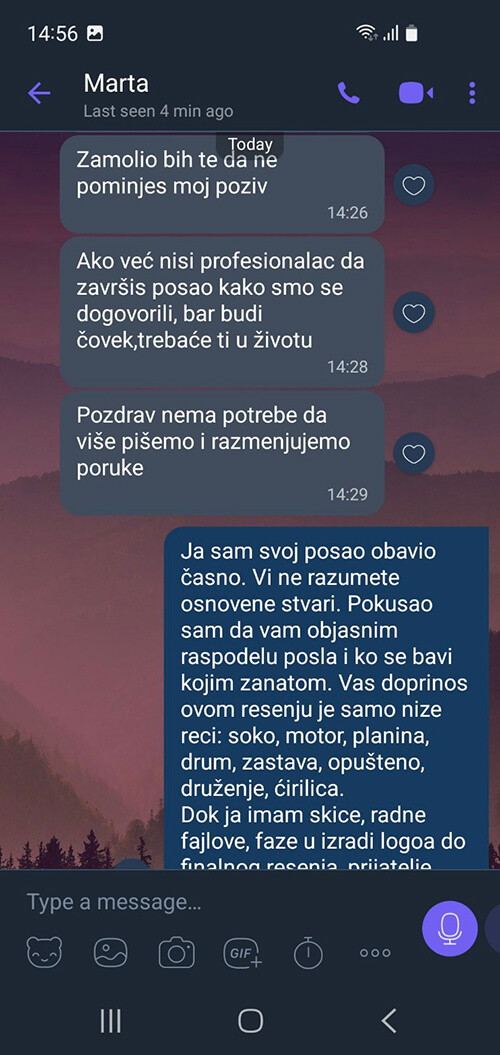
After taking the finished artwork and editable source files, people who had no understanding of the design process, the time involved or even the actual responsibilities of a designer decided – by vote – what my work was worth. The man who had introduced himself as Father Miloš then lectured me about being a decent human being while refusing both fair options: either pay the agreed fee, or pay nothing and stop using my intellectual property.
Nearly two months of work were reduced to a largely symbolic fee of €150 – and even that was apparently too much for an entire motorcycle club to honor.
In the end, they did not save €150. They sold their word, their gratitude and the dignity of the titles they carried for €150.
Embarrassing.
Living and working in
Belgrade Serbia