


e-screen
Logo creation
Logo Design for a Digital Signage Platform
e-screen turns ordinary displays into remotely managed digital signs. Inspired by both the product and its name, I set out to build the idea of a screen directly into the logo.
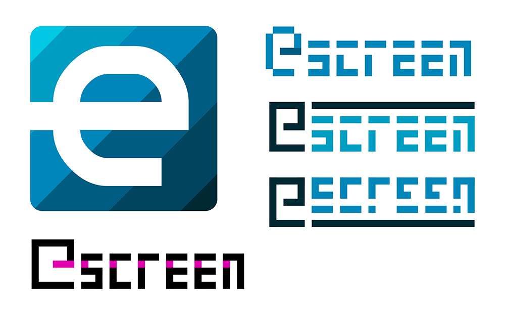
Exploring Different Directions
Early concepts explored two distinct approaches: a modular, pixel-inspired visual language and a more compact symbol combining the letter “e” with the shape of a screen.
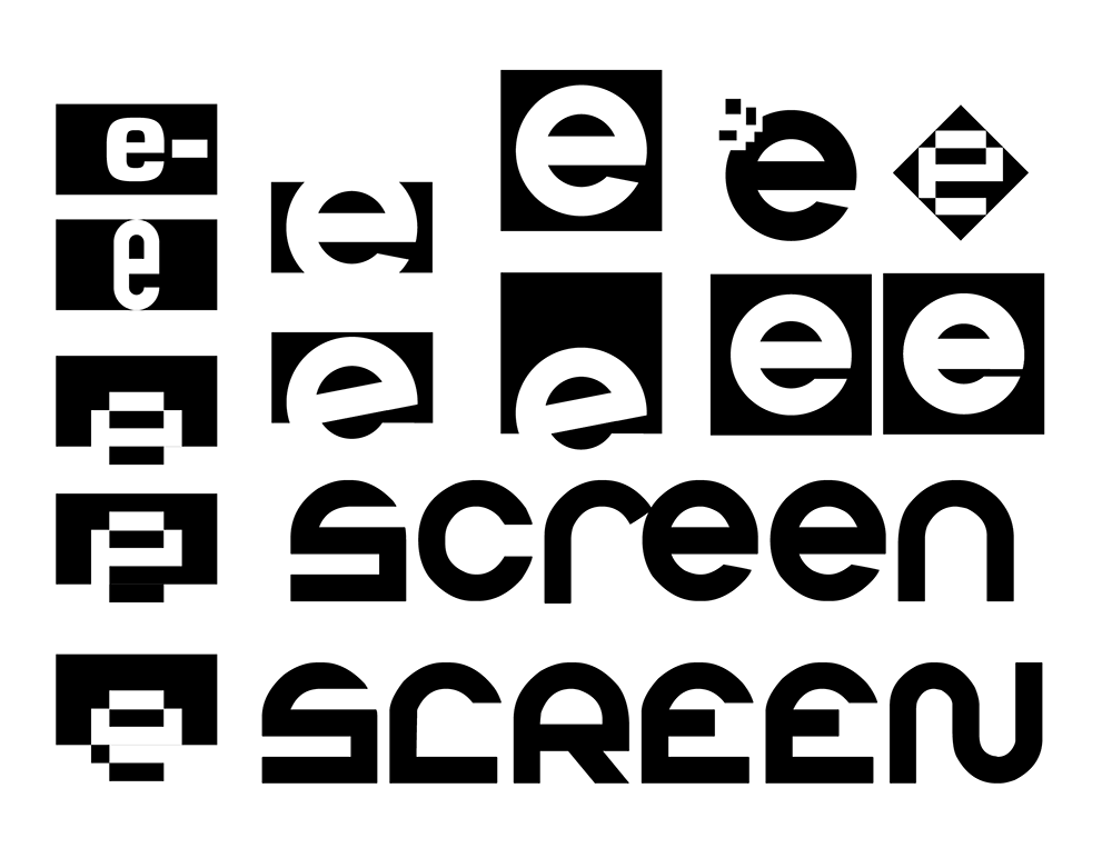
Building the Symbol
The selected direction was refined through different proportions, letter combinations and uses of negative space, gradually turning the “e” and the screen into a single recognizable mark.
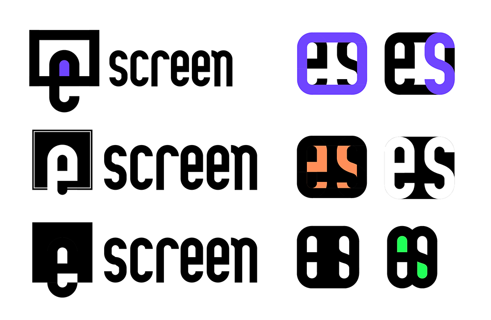
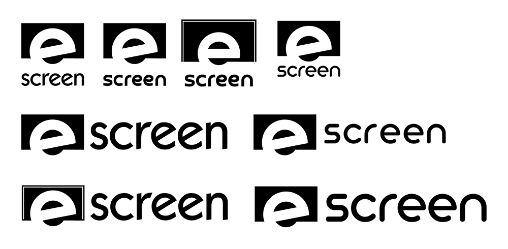
The Final Identity
The final mark combines a lowercase “e” with the shape of a screen. Subtle adjustments to the “r” and “n” give the rounded wordmark a more distinctive character, while the vivid blue reinforces its clear, modern and digital feel.

Living and working in
Belgrade Serbia