Spajalica
Logo creation
Connecting People Through Experience
Petlja connects activists, civil society organizations and experts based on their field, location and expertise, helping them exchange practical knowledge and overcome challenges together. The platform was originally named Spajalica, which shaped the initial idea of a visual identity built around connecting people.
Exploring Different Directions
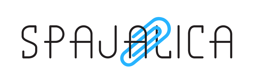
Early concepts explored how the familiar shape of a paperclip could be integrated directly into the name, creating a simple and immediate symbol of connection.
Connecting the Words
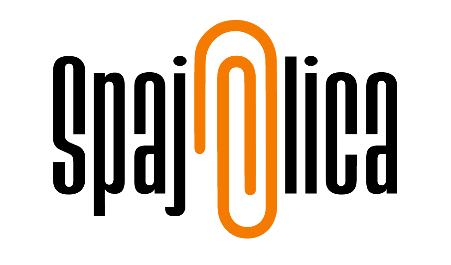
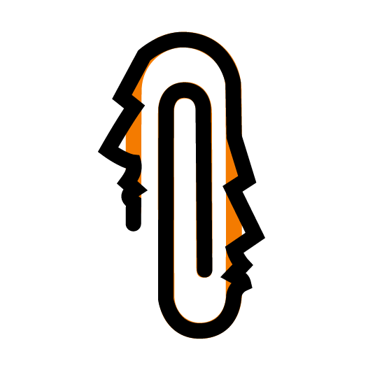
Once the right typeface was found, half the work was already done. Its tall, compact letterforms fit naturally within the silhouette of a paperclip. Rather than replacing a single letter, I split the name into “spaja” and “lica” and connected them with a paperclip symbol formed by two opposing faces.
The Final Spajalica Identity
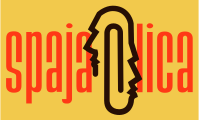
The final identity brings the entire idea together: the name is divided into “spaja” and “lica” while the central paperclip – shaped by two opposing profiles – visually connects both the words and the people behind them.
A Last-Minute Name Change
Just before launch, the platform was renamed from Spajalica to Petlja. The new identity was developed around a simple loop symbol, preserving the original idea of connection while adapting it to the new name.
Check out the website.


Living and working in
Belgrade Serbia