

VEND gaming
Logo creation
A Marketplace Between Players
VEND Gaming was conceived as a marketplace where players could buy and sell in-game currency, items and other digital assets using real money. Acting as a trusted intermediary, the platform would protect both sides of each transaction – ensuring that buyers received what they paid for and sellers received their money – while earning a percentage from every completed trade.
Exploring the Exchange
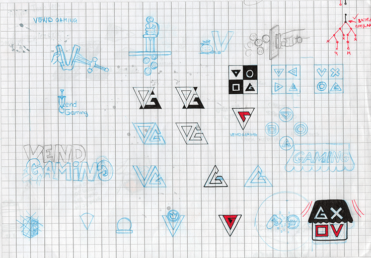
The early sketches explored ways to combine gaming with the idea of a protected transaction between two players. I experimented with coins, arrows, shields and different uses of the letter V, searching for a simple symbol that could represent buying, selling and the platform standing securely between both sides.
From Pixels to Simplicity
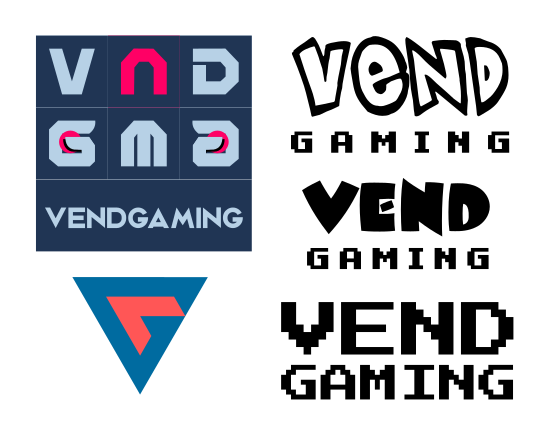
The first digital concepts explored old-school pixel typography and visual references to classic gaming. In one direction, I mirrored two letter Gs inside a navy square, attempting to turn them into two hands and thumbs holding a game controller. The idea proved too subtle to read clearly, so I gradually stripped away the symbolism and focused on a clean typographic solution that eventually led to the final logo.
The Final Identity
The final direction remained primarily typographic, but I still wanted it to carry an unmistakable trace of gaming. A playful typeface gives VEND its distinctive character, while the pixel lettering draws from the visual language of classic games. The sword completes the identity with a simple, recognizable symbol – adding just enough fantasy without turning the logo into another predictable gaming emblem.

Living and working in
Belgrade Serbia