
Vidra
Children’s Swimming Academy
From Orka to Vidra
The project began as a visual identity for Orka, a swimming school for children. The name later evolved into Vidra (otter), inspired by the familiar phrase “kao vidra u vodi” and opening the way for a friendlier, mascot-driven identity.
Finding the Right Character
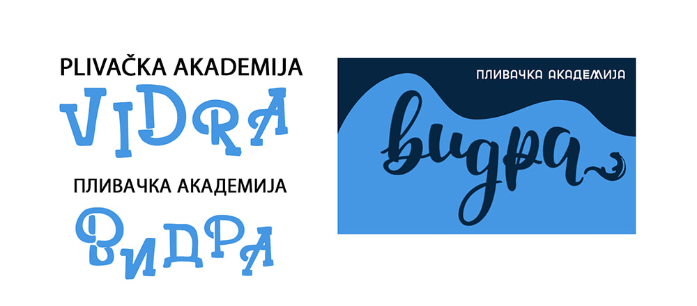
While exploring different typefaces, the first otter symbol began to emerge. Initially reduced to a small silhouette within the wordmark, it introduced the right character but lacked the presence needed to carry the identity.
The Idea Clicked
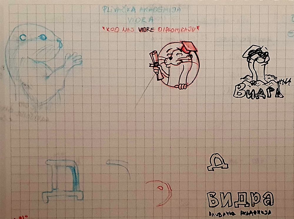
The phrase “Kod nas vidre diplomiraju” immediately brought the mascot to life. The image of a cheerful otter proudly holding its swimming diploma came almost fully formed, and the first sketch captured the idea with barely any iteration.
Refining the Mascot
The original sketch evolved into a friendlier and more expressive mascot. I removed the claws and unnecessary pool details, then enlarged and opened the eyes to give the otter a softer, more approachable character for children.
The Final Identity
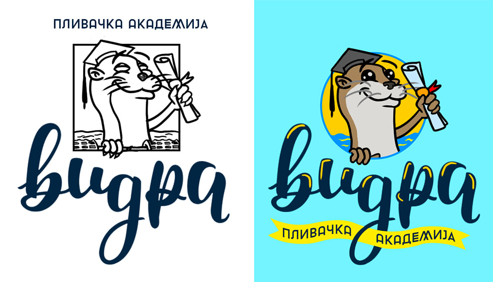
For the final identity, I deliberately chose a friendly, clear and highly legible Cyrillic typeface. By removing unnecessary ornaments and further simplifying the diploma ribbon, the logo became cleaner and easy for every child to read.

Living and working in
Belgrade Serbia